Conditional style formatting in datastudio
To me datastudio is currently lacking proper conditional formating of metrics.
Is it possible to fix this with da vinci tools. It would be great for some metrcis to have the basic possibility to maken the color of numbers red for negatives and green for positives for example.
Answer

I strongly suspect Google is going to come out with something like this eventually. I know I could do it, but I wonder if there might be an alternative.

I don't want to invest into developing something which is very likely to be fixed by Google.
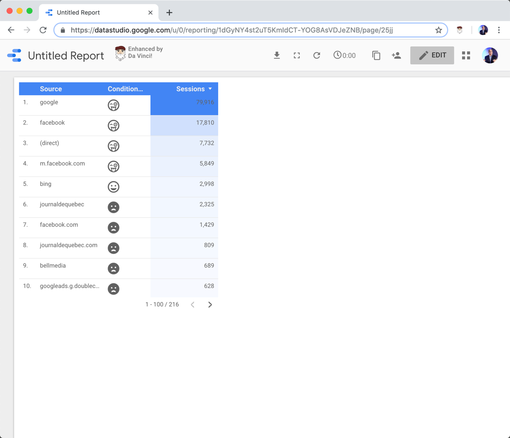
But I had an interesting idea: what if you could use FontAwesome in your dashboard? Anytime something like ${far fa-grin-tongue-wink} would be found in a dimension, it would be replaced by its corresponding FontAwesome:


Done!
Whenever a string of the format ${font-awesome icon} is found in a dimension, it will be replaced with its corresponding icon. It's not quite conditional formatting, but with calculated fields, you can use icons in a similar way.
So something like ${far fa-grin-tongue-wink fa-2x} will be replaced by the grin-tongue-wink smiley.
Cool isn't it! :)


Wow. Yeah pretty cool it is! :-)
Thanks Stéphane!
And agree on the will be there part. Lately there have been lots of improvements on datastudio. And probably this will be one for the near future.
Customer support service by UserEcho


Done!
Whenever a string of the format ${font-awesome icon} is found in a dimension, it will be replaced with its corresponding icon. It's not quite conditional formatting, but with calculated fields, you can use icons in a similar way.
So something like ${far fa-grin-tongue-wink fa-2x} will be replaced by the grin-tongue-wink smiley.
Cool isn't it! :)